

The Ultimate Blueprint for WordPress Mastery: Designing High-Performance Sites with Elementor and Custom CSS
In the ever-evolving landscape of modern web development, creating a digital presence that stands out visually while maintaining blazing-fast performance is the ultimate goal for every professional developer and designer. WordPress has long reigned supreme as the world’s leading content management system, offering unmatched flexibility, extensibility, and scalability. However, building truly bespoke, lightning-fast, and visually captivating websites requires moving beyond standard pre-built templates and mastering advanced design toolkits.
Among these modern toolkits, Elementor has completely revolutionized how we approach page creation and front-end layout structuring. By combining the visual freedom of an intuitive drag-and-drop interface with the granular control of custom CSS, developers can build unique digital experiences without getting bogged down by repetitive coding cycles. This comprehensive guide explores how you can leverage advanced Elementor container structures, custom CSS styling techniques, and strict performance best practices to take your web design skills to the absolute next level.
1. The Evolution of WordPress Layouts: Moving Beyond Traditional Sections
For many years, building layouts in page builders relied heavily on traditional section, column, and inner-section hierarchies. While this system worked well for basic static pages, it introduced a significant amount of unnecessary HTML markup—often referred to in the development community as div soup. This excess markup could slow down browser rendering times, increase DOM depth, and make mobile responsiveness tricky to fine-tune across different device viewports.
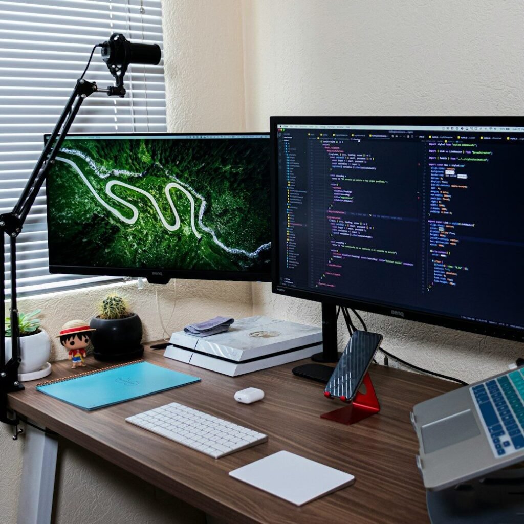
The modern era of web design demands cleaner code and faster rendering pipelines. The introduction of Flexbox Containers completely transformed this workflow. Inspired by modern CSS Flexbox standards, containers allow developers to build fluid, highly responsive layouts with minimal DOM depth. Understanding how to manage direction, alignment, wrap properties, and gap spacing within a container gives you absolute precision over how elements behave across desktop, tablet, and mobile screens.
When structuring a modern homepage or landing page, utilizing containers allows you to align items horizontally or vertically with just a single click. By keeping your underlying markup clean and lightweight, your browser can paint pixels onto the screen much faster, leading to superior Core Web Vitals scores and significantly happier visitors who never have to wait for a lagging interface.
2. Unleashing Creative Freedom with Custom CSS in Elementor
While visual page builders provide an extensive array of default styling controls, there are times when you need a specific design effect that isn’t built into the standard control panel. This is where custom CSS becomes your ultimate secret weapon. By writing targeted CSS rules directly within the Elementor advanced tab or your theme stylesheet, you can unlock limitless design possibilities and make your creations truly unique.
Consider common user interface elements like interactive buttons, product cards, and image galleries. Instead of relying on static designs, you can introduce smooth background hover transitions, subtle box-shadow scaling, and animated border highlights. For instance, adding a continuous rotation effect to a decorative divider line or a smooth glowing border on hover can instantly draw user attention and give your site a premium, high-end feel.
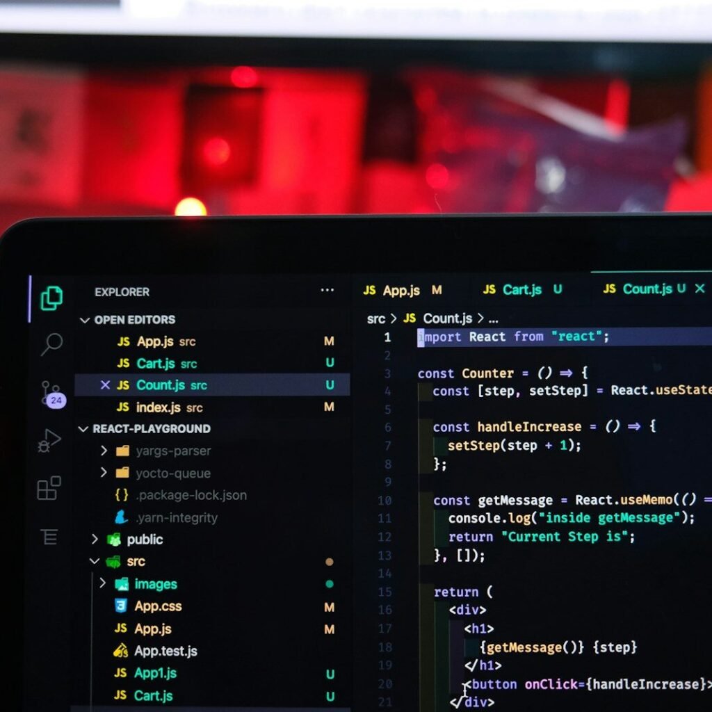
When writing custom CSS for Elementor widgets, utilizing the special selector keyword helps you target specific elements cleanly without affecting the rest of your page. This modular approach ensures your code remains organized, maintainable, and remarkably easy to update as your website grows and expands over time.
3. Crafting Flawless Responsive and Mobile-First Experiences
In today’s digital environment, mobile traffic frequently eclipses desktop usage across almost every industry niche. Designing with a mobile-first mindset is no longer an optional luxury; it is a critical requirement for online success and search engine optimization. When building complex layouts, you must always test your web pages across multiple device viewports, including tablets, landscape phones, and compact smartphones.
Flexbox containers make mobile responsiveness significantly easier through reverse column wrapping, order adjustments, and responsive padding controls. For example, if you have a two-column layout with a visual image on the left and descriptive text on the right, you can easily reverse their display order on mobile devices so the heading appears before the visual asset, preserving natural reading flow.
Furthermore, managing typography scaling, line heights, and spacing using relative units like percentages, em, or rem ensures that your text scales gracefully across screens of all sizes. Paying close attention to these finer details prevents awkward text wrapping, overlapping elements, and horizontal scrolling issues on smaller mobile devices.

4. Optimizing Speed and Performance While Using Page Builders
One of the most common criticisms leveled against heavy page builders is their potential impact on website loading speeds. Because dynamic page builders load additional CSS and JavaScript libraries to render custom widgets, unoptimized setups can lead to bloated page sizes and sluggish performance grades. However, with the right optimization strategies, you can enjoy the incredible design freedom of Elementor without sacrificing speed.
First, enable your builder’s advanced optimization features, such as optimized DOM output and unlinked font loading, which eliminate redundant markup and external request overhead. Second, pair your page builder setup with a robust caching plugin (like WP Rocket or LiteSpeed Cache) and a high-performance content delivery network (CDN) to ensure rapid asset delivery worldwide.
Additionally, be mindful of the widgets and third-party addons you install. Each plugin adds background scripts that your browser must parse. Sticking to core elements, clean CSS styling, and lightweight media assets ensures your website remains lightning-fast and search-engine friendly.

5. Advanced Workflow Tips and Long-Term Maintenance
Mastering website design in WordPress requires a delicate balance of visual creativity, technical precision, and performance awareness. As you continue to build websites for clients or your own personal projects, establishing a streamlined workflow will save you countless hours of troubleshooting and debugging.
Always start your projects with a solid foundation: select a lightweight theme like Hello Elementor or Astra, establish a global design system for colors and typography, and keep your plugin stack lean and secure. Regularly audit your database, clean up unused CSS, compress your media files before uploading, and monitor your Core Web Vitals using tools like Google PageSpeed Insights.
By combining structural efficiency with custom CSS styling and rigorous performance habits, you create truly exceptional digital assets that captivate your audience, rank higher on search engines, and drive real-world business results.

Kya yeh blog post aapki zaroorat ke mutabiq bilkul theek hai?